Enterprise Web App
Art Restoration Studio Website (Laravel + Inertia.js + Vue.js)
Laravel
Vue.js
Inertia.js
Taillwind CSS
Postgres
Postgresql
This premium website showcases an art restoration studio’s services using cutting-edge technology. Built on Laravel 10 for a secure and scalable backend, it uses Inertia.js to deliver SPA-like performance without page reloads, while Vue.js 3 with Composition API powers a highly reactive interface.
Key Features:
Dynamic portfolio with multi-criteria filtering.
Interactive galleries with lightbox.
Blog system for restoration techniques.
Full admin panel for content management, including WebP-optimized image uploads and automatic SEO meta-tag generation.
Responsive design, subtle animations, and sub-2-second load times ensure a premium experience for high-end clients.
Technical Features
Backend (Laravel 10):
Architecture: MVC with Eloquent ORM, custom middleware for protection.
Authentication: Laravel Breeze with Inertia.js (secure sessions, optional 2FA).
API: API resources for portfolio and blog (with data transformers).
Database: MySQL 8.0 (migrations + seeders for initial data).
Security: CSRF protection, SQL injection (via Eloquent), XSS (automatic sanitization). Rate limiting for API and contact form.
Performance: Redis caching for portfolio and blog. Queue system for email sending (with Redis/Beanstalkd).
Frontend (Vue.js 3 + Inertia.js):
Architecture: Reusable components with Composition API.
State Management: Pinia for global state (portfolio filters, user session).
Interactions: Dynamic portfolio filtering (by period, artwork type, technique) with debouncing. Photo gallery with lightbox zoom (using vue-gallery-slideshow). Scroll animations with AOS (Animate On Scroll).
Forms: Real-time validation with VeeValidate and custom messages.
SEO: Dynamic meta-tags per page (using inertia-head). Semantic HTML5 structure + microdata for services.
Design (Tailwind CSS + Custom):
Framework: Tailwind CSS 3.x with custom extensions.
Theme: Minimalist color palette (dark blue, gold, white) with CSS variables.
Responsive: Breakpoints for mobile (sm:), tablet (md:), desktop (lg:).
Optimizations: Lazy-loaded images with vue-lazyload. Local fonts (Inter) for speed. Automatic CSS/JS minification with Vite.
Visual walkthrough
Project Gallery
Use the arrows, dots, keyboard, or swipe to explore.
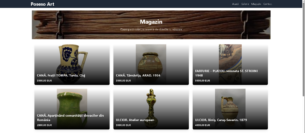
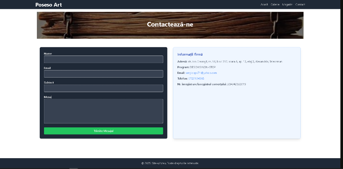
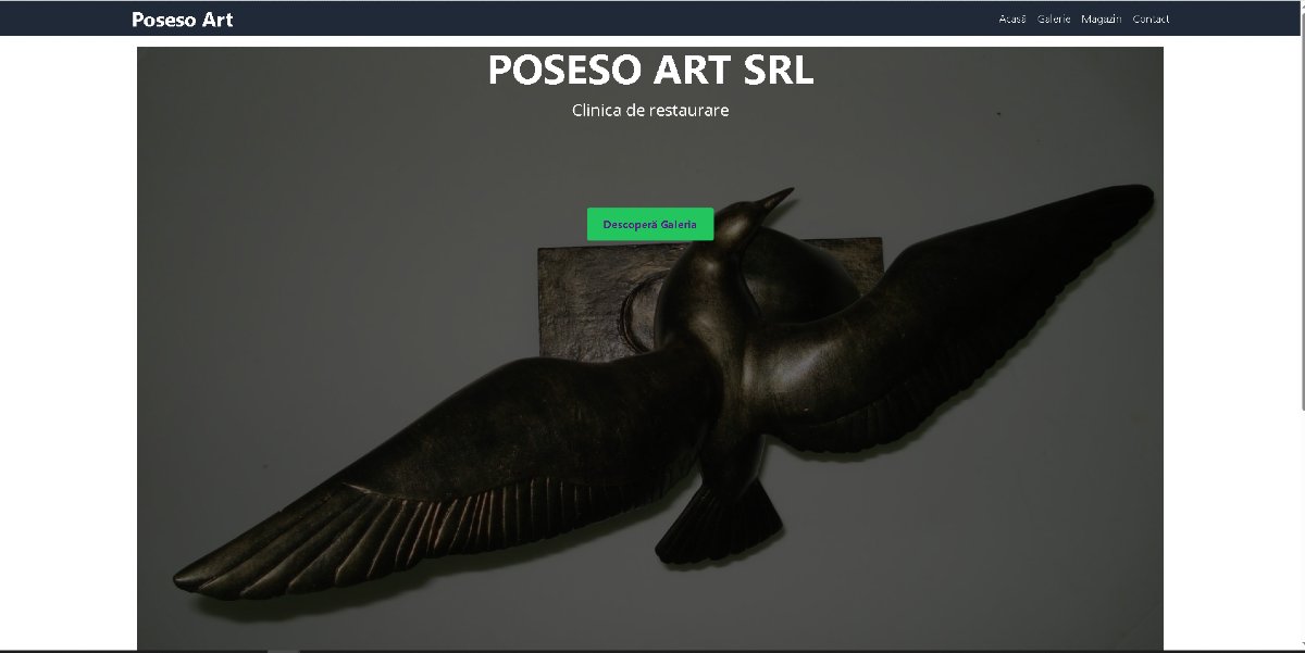
1 / 3